Occasionally we are asked how a magazine cover comes together – from the photo shoot itself, to the selection selection of the image, to the post production and design of the cover.
Behind the Scenes with Jamell Fleming
Granted – every project is unique and the path from start to cover will shift slightly.
However I chose to profile my recent cover shoot with NFL cornerback of the Jacksonville Jaguars, Jamell Fleming.
The project began with the creative development of the shoot. This involved jotting down a list of ideas for what the shoot could look like.
We concepted a variety of shot ideas from shooting on location to shooting in a studio.
Once that was complete – the next step was to run the ideas by the magazine for additional input and feedback. Some ideas were liked whereas some were taken off the list of potentials. It was at this point we decided to take on a three part photo shoot.
The first part would be outdoor action shots on an athletic field. The second two sets would be studio images (one shot on high key white backdrop and the other shot on a solid black backdrop). With this approach we could get three fairly different looks out of a single half-day photo session.
Once that was complete it came to booking locations for the shoot (going through the City to get a permit to shoot on an athletic field) and then renting a location where we could set up our studio in.
Ideas were then sent over to our subject to prep him on what to expect. At that point I hired my contractors (an assistant and a makeup artist for the shoot).
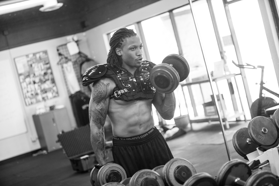
Then it came to the day of the photo shoot. We started with the athletic field shots earlier in the day to avoid too much heat. There are times were I will have samples pulled of poses and show those to the subject – but in this case I had a variety of shots in my head all ready to go. We had Jamell doing a variety of runs, cuts and catches making the images we needed to make.
From there we moved to our studio location for the shots on the white and the black. Each required a different style of lighting. Once again – we had concepts for poses and set ups so the shoot moved pretty efficiently. We were also very fortunate that our subject came with a lot of ideas of their own that we were able to incorporate into the photo shoot.
Normally after the photo shoot – I will sit down and shortlist the images. This is the process of going through the photo shoot to flag the images that I feel best match what the magazine would need (indicating images for both cover options as well as images for the interior spread and main art portions of the feature). The goal is to provide the magazine with enough options to choose from – but not so many as there are subpar images in the mix.
Ultimately the magazine staff makes the final choice and there is often a back and forth with the creative department to ensure the best images are selected for the feature.
Magazine Cover Evolution
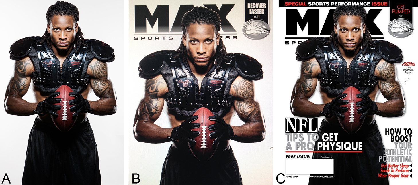
However in this instance – I shot an image that I immediately knew would make a strong cover. I saw it once I snapped the picture, I saw it when I double checked on the back of the camera, I saw it again when I scanned through the images on my computer. (SEE IMAGE “A”)
I became so obsessed with this image that when I sent over the shortlist of the files to the magazine’s editor I also designed a quick mockup of what the image would look like with the magazine logo behind it on the cover of the magazine. (SEE IMAGE “B”)
There were a few other images in consideration for the cover – but I creatively stood by that image. From there the publication began to mockup the cover, adding in headlines, colors and graphics. The idea for this cover was to keep the text on the image as minimal as possible. Some covers will have six-to-eight various headlines, but for this cover they only placed three (including the one in the upper right corner). This allowed the image to be run large on the cover. The colors were kept very simple so as not to distract the viewer – using white, grey, black and one accent color for a small pop. (SEE IMAGE “C”)
Also – because the shoot was structured in a way to allow us to create a wide array of images – we were able to get multiple strong interior shots to compliment the cover feature.
As mentioned – every cover project we take on is slightly unique – but I truly enjoyed how this process went and the results we achieved from this project.
James Patrick
jamespatrick.com
instagram @jpatrickphoto